
Understanding customer behavior is essential for any modern business aiming to improve marketing strategies, customer retention, and profitability. One widely adopted technique in this space is RFM analysis a method that evaluates customers based on three key factors: Recency, Frequency, and Monetary value of their purchases. In this project, I applied RFM analysis using the open-source tool dbt (data build tool) to design a modular, scalable, and testable analytics pipeline.
The dataset used in this project was sourced from Kaggle and ingested using the KaggleHub library. It contains over 20,000 sales transactions from an electronics company, spanning a one-year period from September 2023 to September 2024. Each record captures not just transactional details but also customer demographics, order status, and product information, making it a rich source for behavioral segmentation. Key features include customer_id, purchase_date, product_type, total_price, and loyalty-related fields such as is_loyal_customer. The dataset has been cleaned to reflect a more realistic distribution across gender and loyalty status.
To process and transform the data into meaningful RFM segments, I implemented a four-layer dbt architecture consisting of raw, staging, intermediate, and mart models. Each layer builds upon the previous one, ensuring clear separation of concerns and facilitating debugging, testing, and scalability.
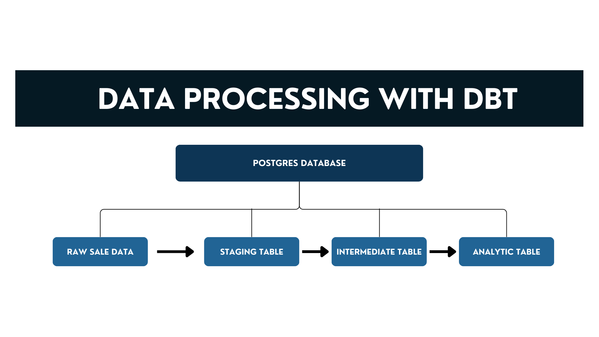
The raw layer acts as the entry point into the dbt pipeline. Here, the sales transaction data is registered as a dbt source using the sources: configuration in the schema.yml file. No transformations occur at this level; instead, it serves as a reference to the underlying table in the PostgreSQL database, preserving the original structure for traceability and auditing.
In the staging layer, represented by the stg_sale_data model, the focus is on cleaning and standardizing the raw data. This includes:
This layer also isolates only the "Completed" orders, since cancelled transactions should not contribute to customer value calculations. The result is a well-structured, analytics-friendly dataset ready for aggregation.
The intermediate layer, defined by the int_customer_rfm model, performs customer-level aggregation. It transforms the row-level transaction data into RFM metrics:
Finally, the mart layer contains the mart_rfm model, where RFM segmentation and scoring take place. Using PostgreSQL window functions, each customer is assigned:
| Layer | Model Name | Purpose | Key Transformations / Outputs |
|---|---|---|---|
| Raw | raw_sale_data | Source registration layer that mirrors the original Kaggle dataset structure. | No transformation; just defines source table with schema and freshness checks. |
| Staging | stg_sale_data | Clean and standardize raw data for analysis. | Rename columns, filter for Completed orders, handle data types, calculate total_price. |
| Intermediate | int_customer_rfm | Aggregate transactions to customer-level RFM metrics. | Calculate recency_days, frequency, monetary, avg_order_value, lifecycle_days. |
| Mart | mart_rfm | Perform scoring and segmentation for final analytics consumption. | Assign quantile RFM scores, generate customer_segment, join loyalty info. |
Before diving into feature engineering or modeling, it is crucial to first understand the underlying patterns, distributions, and anomalies present in the data. Exploratory Data Analysis (EDA) serves as a diagnostic phase where we visually and statistically inspect the key customer behavior metrics Recency, Frequency, and Monetary value (RFM) to uncover trends and detect outliers. In this section, we focus on analyzing the distribution of each RFM component, identifying skewness or sparsity, and evaluating how customers differ in their purchasing patterns. These insights not only help validate the integrity of the dbt-transformed dataset but also guide the feature engineering process by highlighting potential transformations or segmentations that could improve model performance later on.
Before diving into feature engineering or modeling, it is crucial to first understand the underlying patterns, distributions, and anomalies present in the data. Exploratory Data Analysis (EDA) serves as a diagnostic phase where we visually and statistically inspect the key customer behavior metrics Recency, Frequency, and Monetary value (RFM) to uncover trends and detect outliers. In this section, we focus on analyzing the distribution of each RFM component, identifying skewness or sparsity, and evaluating how customers differ in their purchasing patterns. These insights not only help validate the integrity of the dbt-transformed dataset but also guide the feature engineering process by highlighting potential transformations or segmentations that could improve model performance later on.
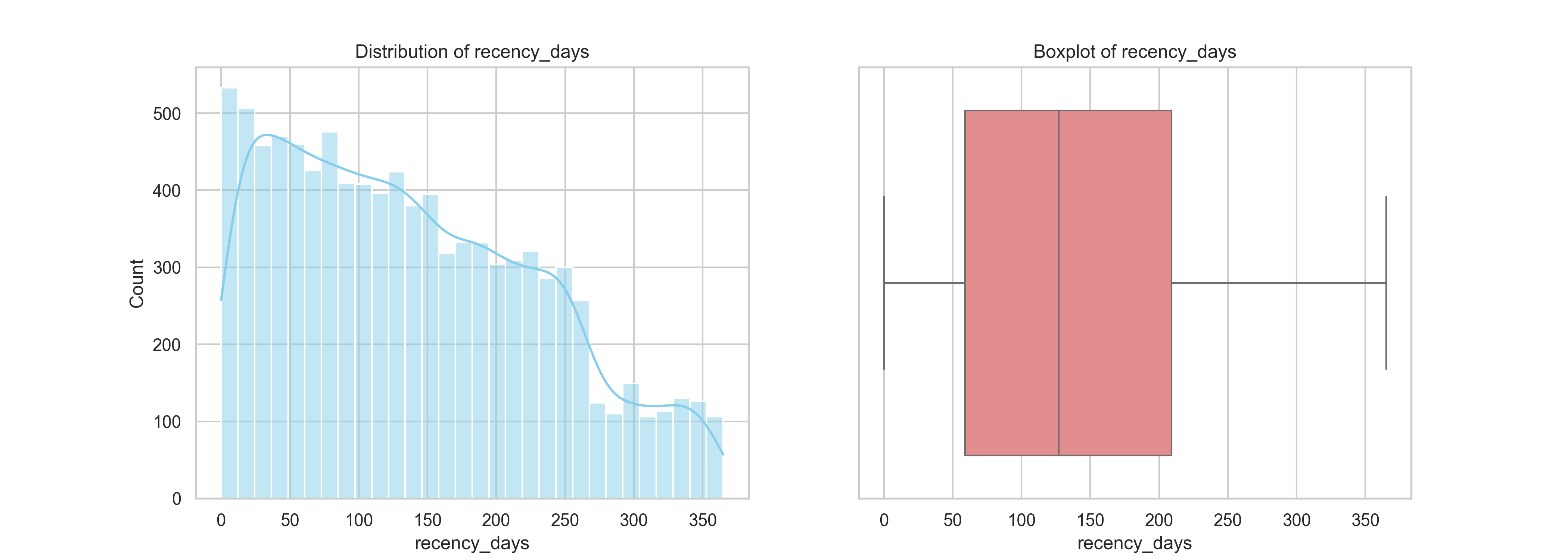
The recency metric represents the number of days since a customer’s last purchase. From the histogram on the left, we observe a right-skewed distribution, the majority of customers made purchases more recently (closer to 350–450 days), with a steady decline in frequency as recency increases. This suggests that a large proportion of customers have been actively purchasing within the more recent months of the dataset’s time window (Sept 2023 to Sept 2024).
In order to know whether we need create a churn flag based on Recency days, first we need to identify whether recency gonna be a strong predictor of customer churn in our dataset. Churn typically means a customer has stopped purchasing for a while, and is unlikely to return. For retail/transactional businesses, you define churn based on inactivity duration usually using the recency_days metric (how many days since last purchase).
To determine a meaningful threshold for identifying customer churn, we examined the distribution of recency days, which measures the number of days since each customer’s last purchase. The histogram shows a relatively steady volume of customers with recency between 350 and 590 days, indicating a significant portion of the customer base remains somewhat active during this period. However, starting around 600 days, there is a noticeable and sustained decline in the number of customers. This drop is not only sharp but also persistent, with customer counts falling below 150 and continuing to decrease through to 730 days.
This pattern suggests a natural behavioral cutoff around 600 days, after which customers are significantly less likely to return. In other words, if a customer has not purchased for more than 600 days, the probability of re-engagement becomes very low. This provides a data-driven basis to define churn: customers with recency days > 600 can be reasonably classified as churned. Establishing this cutoff is critical for segmentation strategies, retention modeling, and targeting win-back campaigns. By distinguishing between at-risk and truly inactive customers, businesses can focus efforts on segments with the highest potential for reactivation while deprioritizing those with minimal likelihood of return.
The boxplot on the right further confirms this pattern, showing a fairly symmetrical interquartile range (IQR) centered around 500 days, with no extreme outliers detected. The IQR spans from roughly 410 to 550 days, indicating a concentrated cluster of customer recency in this range. This distribution is relatively stable and does not exhibit high variance, which is advantageous for segmentation purposes.
From a business perspective, this insight highlights a healthy level of recent engagement among customers, but it also reveals a long tail of inactive customers. These inactive users may require reactivation campaigns or loyalty incentives to bring them back. Overall, the recency distribution is a valuable input to RFM scoring and later segmentation.
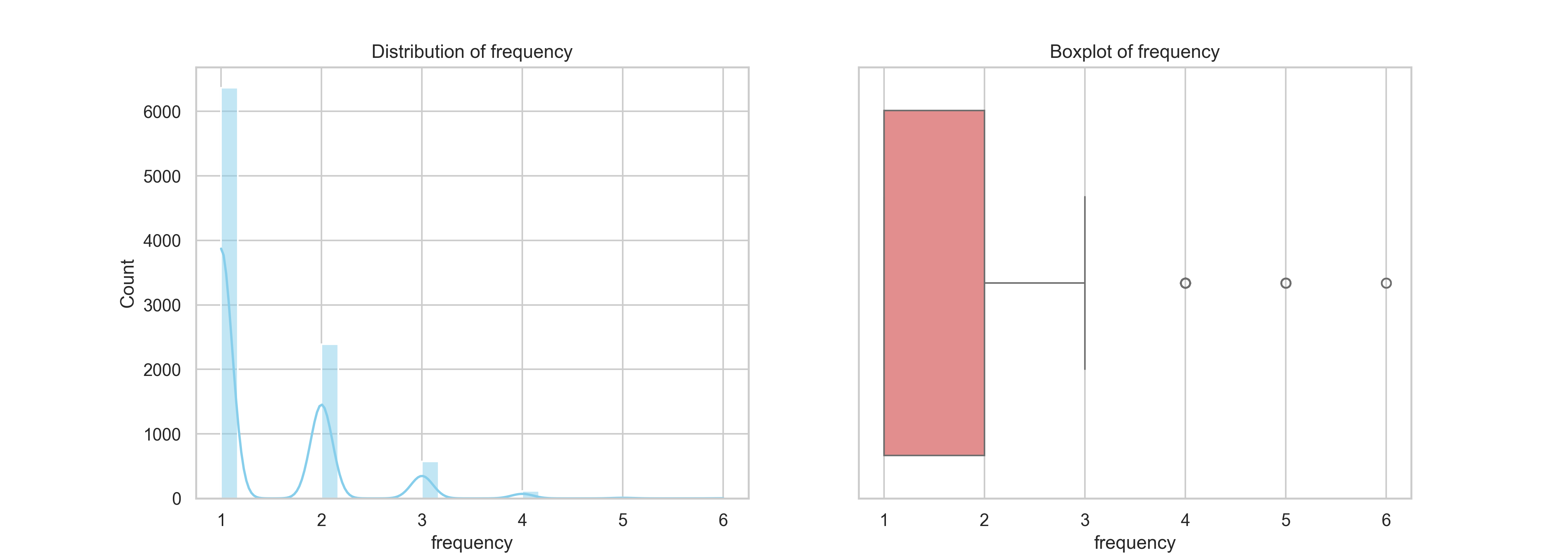
The frequency variable measures how often each customer made a purchase during the period from September 2023 to September 2024. The histogram illustrates a highly right-skewed distribution, with the majority of customers making just one transaction. Specifically, over 6,000 customers fall into this one-time buyer category. A few notable spikes appear at 2 and 3 purchases, but beyond that, repeat transactions taper off significantly.
The boxplot further emphasizes this concentration around low-frequency values, with a median of 2 and an interquartile range (IQR) between 1 and 3. There are some outliers with 4 to 6 purchases, which represent high-value, loyal customers. These outliers may be few in number but carry substantial strategic importance for future campaigns.
This distribution signals a clear business opportunity. The heavy reliance on one-time buyers suggests the need for a retention-focused strategy. Converting even a small portion of these one-time buyers into repeat customers could significantly improve overall revenue. This insight directly informs the next phase of our project, where we leverage RFM-based customer segmentation to design targeted marketing campaigns, prioritizing customer loyalty, re-engagement, and upselling efforts.
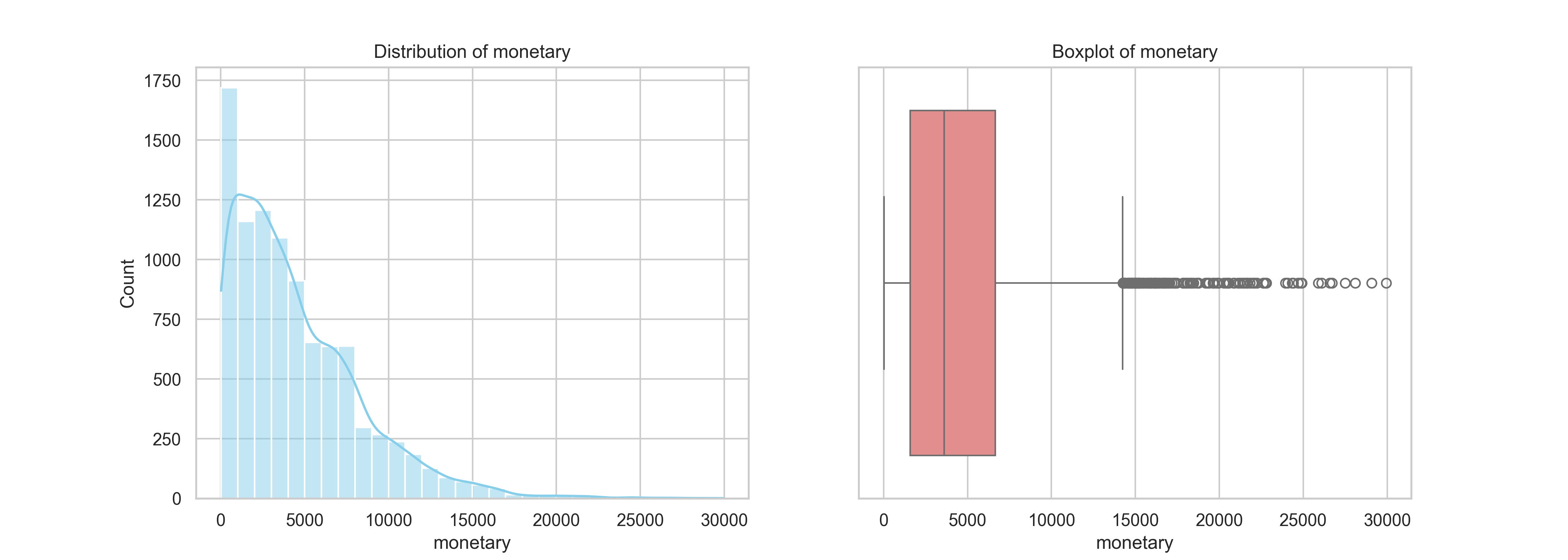
The monetary value represents the total amount each customer spent between September 2023 and September 2024. The histogram shows a right-skewed distribution, where most customers spent less than 5,000 units during the period. A steep drop-off follows, with very few customers exceeding 10,000, and only a small number reaching as high as 30,000. This pattern is quite common in transactional datasets, where a minority of high-value customers contribute disproportionately to total revenue.
The boxplot confirms this skew, with a median monetary value around 4,000 and an interquartile range (IQR) from roughly 2,000 to 7,500. Beyond this, a long tail of outliers stretches far to the right, indicating the presence of very high-spending customers. While these outliers are relatively rare, they are extremely valuable and should be treated as a strategic asset.
These findings reinforce the importance of value-based segmentation in our marketing strategy. High-spending customers offer excellent opportunities for VIP loyalty programs, exclusive promotions, or priority service, while those in the lower spending brackets may benefit from cross-selling, bundle offers, or price-sensitive campaigns. This analysis supports our upcoming move into customer segmentation to enable more personalized and cost-effective targeting.
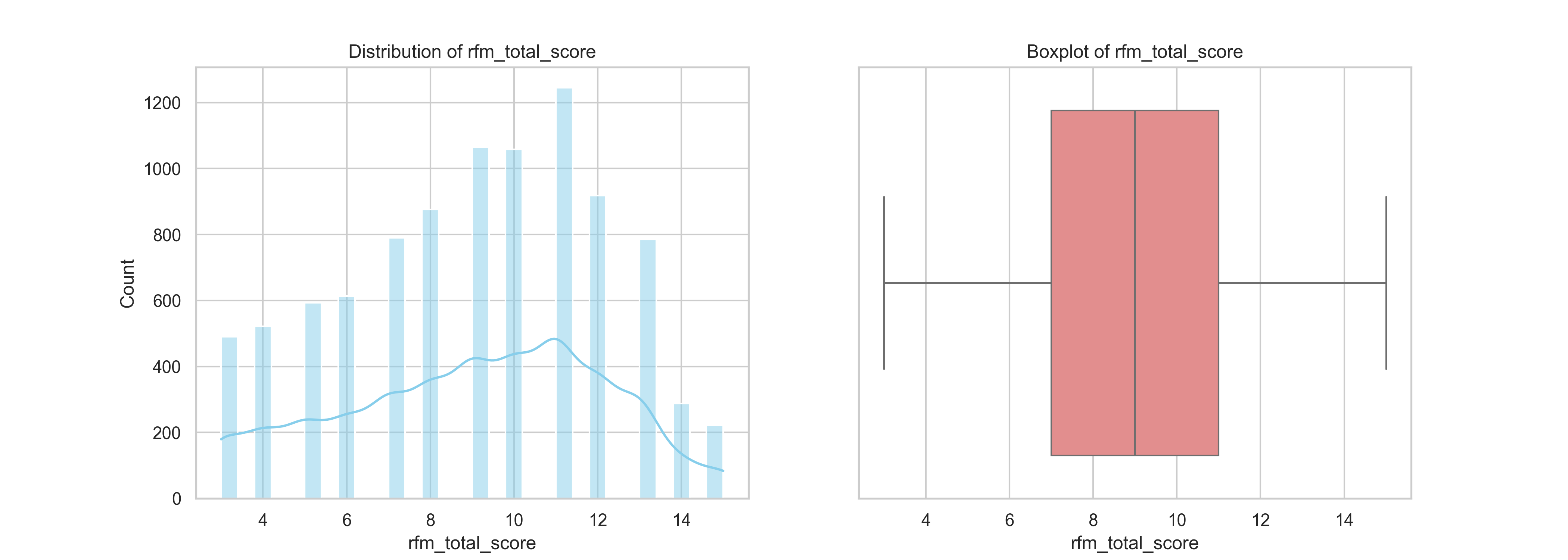
The RFM total score is a cumulative metric that encapsulates customer engagement and value by summing the recency, frequency, and monetary scores (each ranging from 1 to 5). This score helps identify how actively and profitably a customer interacts with the business.
The distribution plot shows a concentration of customers scoring between 7 and 11, with the highest frequency around scores 7 and 8. This indicates that most customers exhibit moderate purchasing behaviour. On the lower end, fewer customers have scores below 5, suggesting that truly inactive or low-value customers are less common in this dataset. On the higher end, only a small portion of customers achieve scores near 15, marking them as high-value, high-engagement customers.
The boxplot further supports this pattern with a symmetrical interquartile range and no significant outliers. The middle 50% of customers fall between scores 7 and 11, indicating a relatively consistent and stable customer base.
This summary of the RFM total score distribution gives us a clear overview of how customer value is spread across the base, which will be useful for the next step which defining customer segments for more targeted analysis and strategy.
The pie chart illustrates the distribution of customers based on their participation in the loyalty program. A substantial 66.4% of the customer base is enrolled in the program, leaving 33.6% not participating. This indicates that a majority of customers have shown enough brand engagement or purchase behavior to warrant joining the loyalty scheme, suggesting that the program is relatively well adopted and likely provides tangible value or incentives.

From a marketing and customer strategy perspective, this is a positive signal, the business has already secured a large segment of repeat customers who can potentially be nurtured further through personalized offers, early access promotions, or exclusive benefits. These "loyal" customers often serve as a foundation for consistent revenue and advocacy.
However, the remaining one-third of customers not participating represents a strategic opportunity. These individuals may include:
By cross-analyzing this loyalty data with customer segments (e.g., Recency, Frequency, Monetary), the business can tailor campaigns to:
In short, while the loyalty program appears effective, a focused effort on the non-participating 33.6%, particularly within valuable or strategically important segments that could unlock additional value and help strengthen customer lifetime value.
To uncover temporal patterns in customer purchasing behavior, we conducted a time trend analysis using the purchase_date field from the sales data. This allowed us to examine how key metrics such as the total number of orders and average spend per order evolved on a monthly basis. By observing these trends over time, we can identify seasonality, assess performance shifts, and gain insights that can guide business planning, promotions, and inventory management strategies.
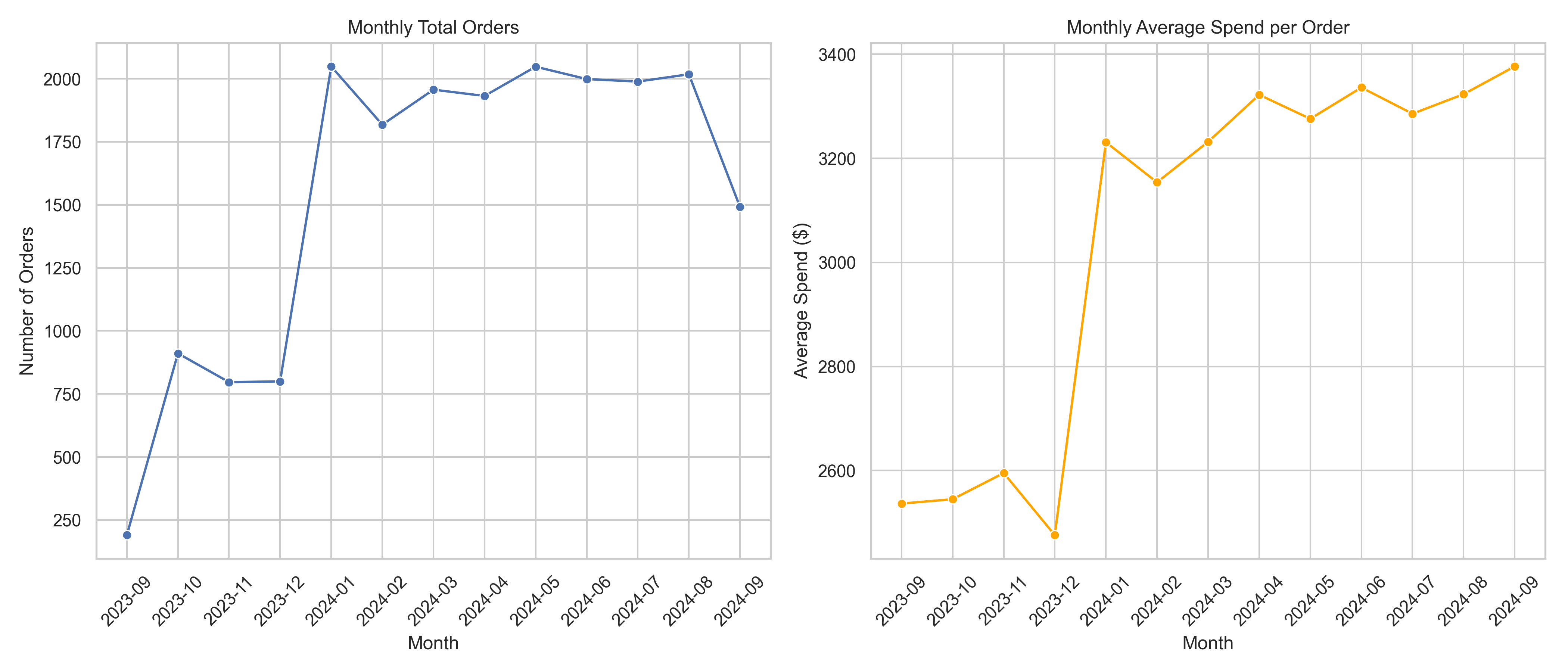
The number of orders saw a notable rise beginning in January 2024, following a relatively modest volume in the final months of 2023. This surge could potentially be attributed to a successful marketing campaign or seasonal promotions at the beginning of the year. From January to August 2024, the volume remained relatively stable around the 2000 orders mark, indicating consistent customer engagement and retention. A slight dip is observed in September 2024, which could suggest the start of an off-peak season or external factors impacting purchasing behavior.
While the order volume increased in early 2024, the average spend per order experienced a significant jump from December 2023 to January 2024, leaping from around $2,500 to over $3,200. This sharp rise may suggest a change in purchasing behavior—perhaps customers bought higher-value items, bulk orders, or add-ons. From February to September 2024, the average spend stayed consistently high, fluctuating slightly around the $3,300 range, signaling that customer value per transaction remained strong even as the number of orders plateaued.
The stable order volume and rising average spend indicate healthy customer demand and potential improvement in product mix or pricing strategy. These trends can support decisions related to stocking high-value items, maintaining customer engagement campaigns during slower months, and preparing for peak seasons by leveraging historical spikes like the one in January 2024.
To better understand customer engagement and sales dynamics over time, we examined two key time-based performance metrics:
The trend for monthly unique customers reveals a sharp increase from September 2023 to January 2024, where the count nearly tripled, suggesting either a successful marketing push, seasonal demand, or customer acquisition campaign. The peak in January 2024 (1,930 customers) coincides with the rise in total orders and average spending, reflecting strong post-holiday demand or a retention effort from December shoppers.

From February 2024 onwards, the number of unique customers remains consistently high, hovering just below 1,900 through August 2024, before a moderate dip in September 2024. This decline could be early signs of seasonality, reduced promotions, or market saturation — and may warrant further investigation into churn or decreased acquisition efforts. In general, the business sustained high customer engagement after the initial surge, indicating good customer retention, but the recent drop may call for reactivation strategies.
The units sold per month show a strong correlation with unique customers and order volumes, spiking from just over 1,000 units in September 2023 to over 11,000 in January 2024. This dramatic increase aligns with a pivotal growth period in the business — possibly driven by promotions, holiday shopping, or expanded product lines.
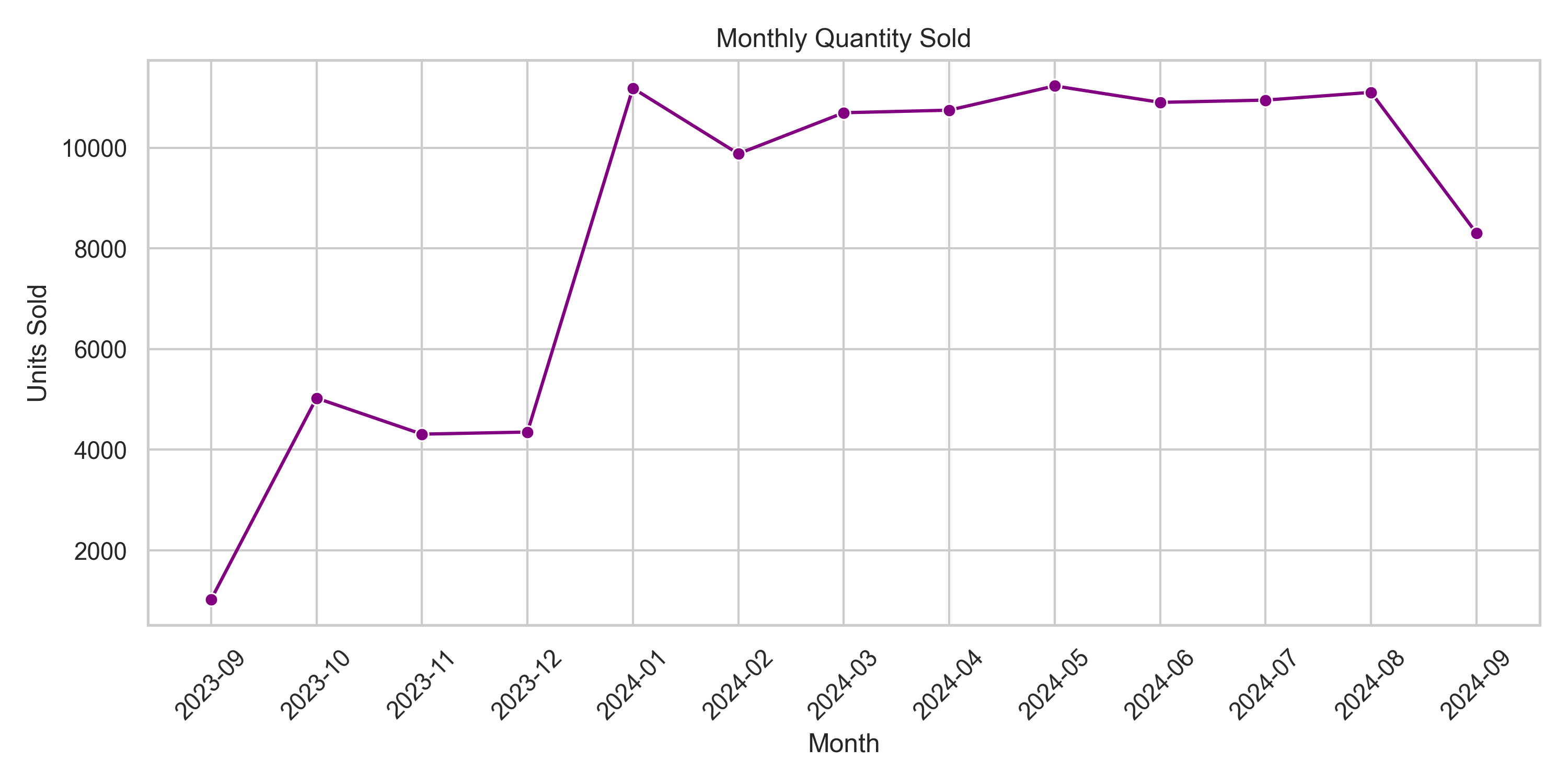
From February to August 2024, the total units sold stabilized between 10,600–11,200 units, showing strong and consistent sales activity. Interestingly, the quantity sold plateaued more tightly than the customer count suggesting either more consistent purchasing behavior per customer (loyalty effect) and higher repeat buying (frequency increase) or fewer very large orders.
The drop in September 2024, again, reflects a synchronized decline across multiple metrics — signaling the need for proactive action (e.g., new campaigns, promotions, or loyalty refreshers). In general, after an initial growth phase, the business maintained high sales volume with steady customer activity which demonstrating product-market fit and purchasing consistency.
To assess whether the monetary component of RFM scoring is biased by extreme customer spending, we conducted a statistical outlier analysis using the IQR (Interquartile Range) method. This approach identifies outliers as values that lie beyond the upper threshold, defined as Q3 + 1.5 × IQR, where Q1 and Q3 represent the 25th and 75th percentiles, respectively. Applying this method to our dataset, we found:
| Metric | Value |
|---|---|
| Number of outliers | 234 |
| Percentage | 2.47% |
| Max Monetary Value | 29,937.93 |
| Median Monetary Value | 3,610.26 |
Despite their small proportion, these outliers have a significant impact. The maximum recorded monetary value is $29,937.93, which is dramatically higher than the median value of $3,610.26—a difference of more than eight times. This considerable gap highlights a strong right-skewed distribution, indicating that a few high-spending customers are disproportionately pulling up the upper end of the monetary scale.
This skewness has important implications for RFM scoring. Traditional RFM models often assign scores (typically from 1 to 5) based on quantiles or bins. However, extreme outliers can stretch these bins, leading to a situation where the highest monetary score (5) is reserved for a very small number of elite spenders. Meanwhile, average or even moderately high spenders may be pushed into lower score categories, not because they are low-value customers, but because the distribution has been distorted by outliers. This results in biased and less informative segmentation, where the model fails to reflect meaningful differences among the majority of customers.
To address this issue, it is advisable to apply data transformation techniques prior to scoring. Methods such as logarithmic transformation can reduce the impact of large values by compressing the scale. This techniques help ensure that the monetary score reflects the broader customer base more accurately, making the segmentation process more actionable and fair.
To uncover behavioral patterns in customer purchasing habits, particularly whether certain product types are associated with higher spend or volume, we performed a product – level aggregation of transaction data. This analysis is a crucial step in answeing whether there is a pattern in customer buying behavior for different product types or payment.
We grouped the dataset by product type and computed several key metrics for each category including:
| Metric | Description |
|---|---|
| Total Spend | Cumulative revenue generated by each product type |
| Total Quantity Sold | Total number of units sold |
| Unique Customers | How many distinct customers purchased each product |
| Average Spend and Quantity | To help standardize comparisons |
According to the figure, the smartphone category had the highest total spend and total quantity sold, indicating strong market demand. It suggests not only frequent purchases but also higher price points, making it the most lucrative category overall. While laptops generated significant revenue, their quantity sold was lower than that of smartwatches or tablets, indicating a higher average price per unit. Conversely, smartwatches showed high sales volume with slightly lower total revenue, suggesting moderate unit pricing and opularity. Tablets had a moderately strong presence in both revenue and volume, implying a stable, mid-range performance among all product types. Despite being a common accessory, headphones showed the lowest total spend and quantity, possibly due to lower pricing, less frequent purchases, or replacement cycles.
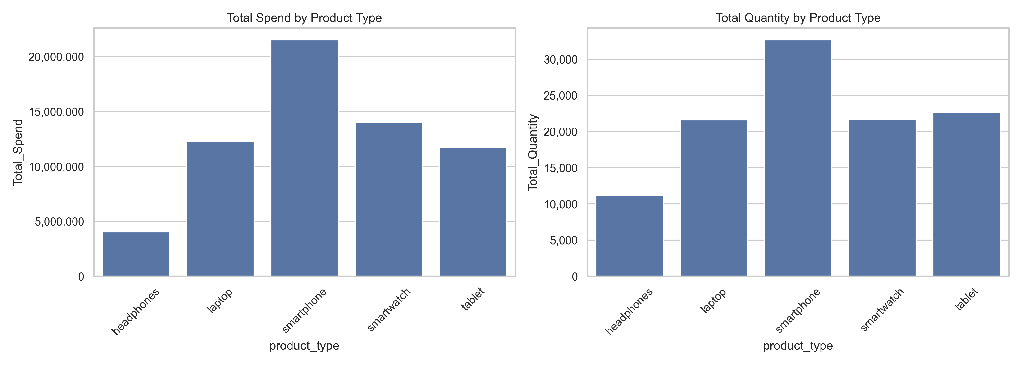
These results clearly demonstrate distinct purchasing behaviors associated with different product types. High-value, high-demand items like smartphones attract both volume and revenue, while niche or lower-cost items like headphones contribute less to overall sales. This segmentation helps businesses prioritize marketing strategies, stock management, and promotional targeting based on profitability and popularity.
To deepen our understanding of customer purchasing behavior, we explored whether different payment methods are associated with distinct spending or purchasing patterns. The hypothesis is that some payment methods may correlate with higher transaction volumes or values, reflecting customer preferences, ease of payment, or even socioeconomic profiles. We grouped the dataset by payment method and computed the following key metrics for each method:
| Metric | Description |
|---|---|
| Total Spend | The cumulative revenue generated by each payment method. |
| Total Quantity Sold | The total number of units purchased using each method. |
| Unique Customers | The number of distinct customers associated with each method. |
| Average Spend & Quantity per Transaction | To help standardize comparisons across different payment channels. |
According to the plots, PayPal and Credit Card methods recorded the highest total spend and total quantity sold, indicating they are the most frequently and heavily used methods. Their popularity may be attributed to convenience, buyer protection, or compatibility with online platforms. This suggests that customers who prefer these methods tend to spend more overall, possibly due to higher transaction values or more frequent purchases.
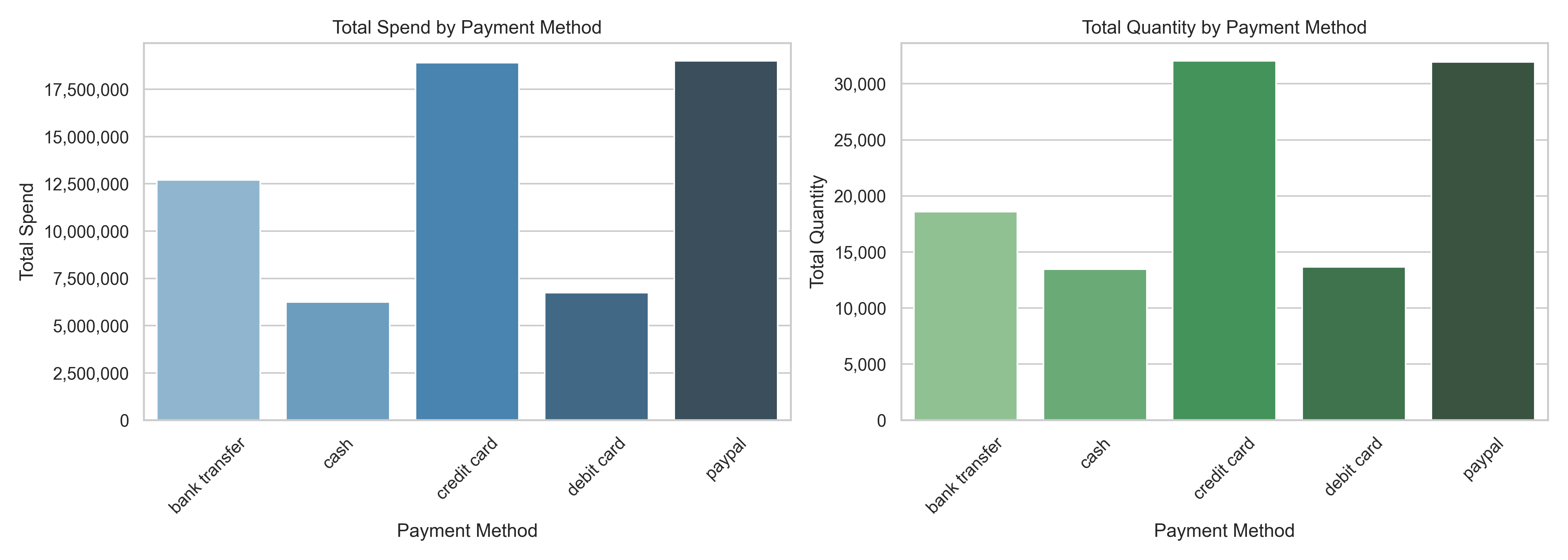
Bank Transfer also demonstrated a strong total spend and moderate volume, implying that it is favored for higher-value transactions, potentially by customers who are more deliberate or price-sensitive. On the other hand, Cash and Debit Card payments showed comparatively lower values in both spend and quantity, suggesting they are used for smaller or occasional purchases.
These findings help segment customers based on their preferred payment channels. Businesses can leverage this information to personalize payment options, incentivize high-spend channels, and optimize transaction experiences. For instance, offering promotions for credit card or PayPal payments might enhance revenue generation, while alternative payment methods like cash or debit cards may appeal more to cost-conscious segments
To enrich our customer segmentation efforts, it is essential to go beyond standard RFM metrics and derive new features that reflect meaningful behavioral patterns observed during our earlier analysis. One such insight was the presence of customers with high monetary value but low purchase frequency, suggesting that some buyers may make infrequent yet large purchases possibly due to bulk buying or premium product preference. This behavior motivates the creation of the basket size feature, calculated as monetary / frequency, which captures the average spend per transaction. By incorporating basket size, we can better distinguish between frequent small-scale buyers and occasional high-value customers, enabling more tailored marketing strategies.
Additionally, our recency distribution analysis revealed long periods of inactivity for some customers, while others showed consistent engagement over time. This observation highlights the value of tenure_days, defined as the time span between a customer’s first and last purchase. Tenure helps differentiate between new short-term customers and long-standing but recently inactive ones. When combined with recency and frequency, this measure can offer a more holistic view of customer lifecycle stages. Together, basket_size and tenure_days enhance the robustness of our segmentation model by capturing nuanced behavioral dimensions that raw RFM scores alone may overlook.
As part of our exploratory data analysis, we have already uncovered meaningful behavioral differences across product types and payment methods. Customers do not interact with the product catalog uniformly, some consistently purchase the same category, while others explore a broader range. To capture this behavior more explicitly, we propose engineering a product diversity feature that quantifies the number of unique product types purchased by each customer. This measure can help differentiate between single-need, focused buyers and exploratory, high-potential customers who may be receptive to upselling or cross-category promotions.
In parallel, understanding customer sentiment is also crucial in segmentation, especially when it comes to retention strategies. If available, incorporating an average rating feature allows us to assess each customer's overall satisfaction or criticality. This is particularly important for identifying segments of high spenders who are also consistently dissatisfied as a group that may be at risk of churn despite their monetary value. Conversely, low-frequency customers with high satisfaction scores might warrant re-engagement strategies. Together, these two features provide a richer behavioral and attitudinal layer to our RFM-based clustering and open opportunities for more targeted and effective marketing interventions.
While recency is already included as a continuous measure (days since last purchase), business users often prefer interpretable categories for easier analysis and reporting. To bridge this gap, we introduce recency buckets, which classify customers into intuitive time ranges such as 0–3 months, 3–6 months, 6–12 months, and 12+ months. This binning not only enhances readability in BI dashboards but also enables quick segmentation for targeted campaigns. For example, customers in the 0–3 month bucket may represent the most active and engaged group, whereas those in the 12+ month bucket signal dormant or at-risk customers. By aligning continuous values with clear business categories, the recency bucket feature strengthens communication between data-driven insights and strategic decision-making.
Similar to recency, raw frequency values can vary widely but may lack intuitive meaning for stakeholders. To improve interpretability, we define frequency buckets that classify customers into groups such as One-time Buyers, Occasional Buyers, and Frequent Buyers. This categorical perspective makes it easier to distinguish casual customers from loyal repeat purchasers. For example, "One-time Buyers" may be more receptive to reactivation offers, while "Frequent Buyers" could be ideal candidates for loyalty programs or premium membership tiers. Incorporating frequency buckets provides business teams with actionable categories that can be directly mapped to retention and growth strategies.
Lastly, to directly support retention analysis, we engineer a binary is_churned flag that marks whether a customer should be considered churned based on their recency bucket. For example, customers who have not purchased in the last 12 months may be flagged as churned. This feature creates an immediate view of customer attrition and provides a key dependent variable for churn-focused analytics. Beyond clustering, this field can also serve as a label for supervised learning models (e.g., churn prediction), enabling future extensions of this project into predictive modeling. By explicitly identifying churned customers, the pipeline provides a direct mechanism to prioritize win-back campaigns and reduce revenue loss.

To ensure that our customer segmentation model is both robust and interpretable, we conducted a correlation heatmap analysis to identify multicollinearity and redundant features within our dataset.
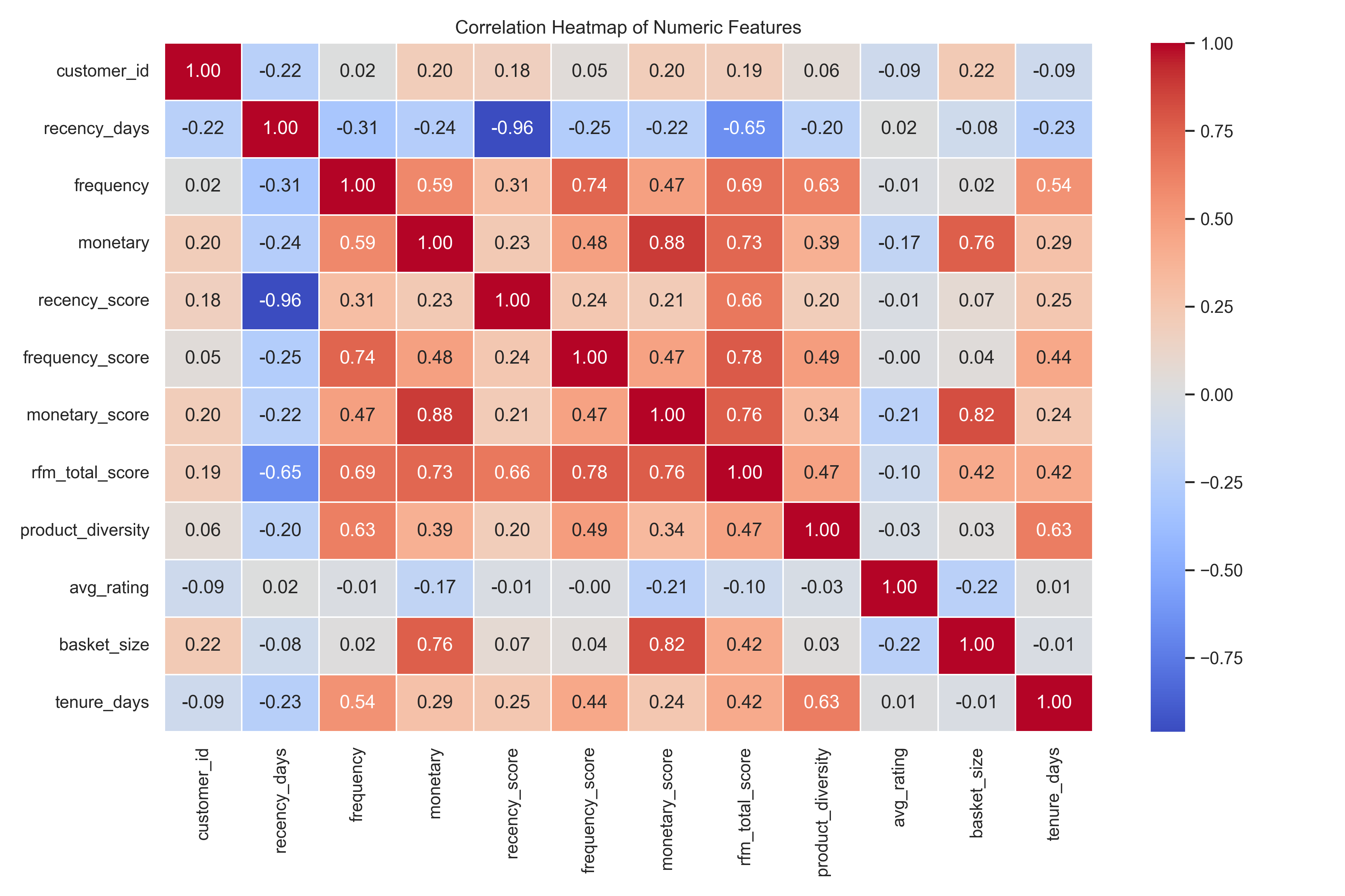
The heatmap reveals several pairs of variables with high correlations (above 0.75), particularly between the raw features and their corresponding RFM score representations. Notably, monetary and monetary_score (ρ = 0.88), frequency and frequency_score (ρ = 0.74), and rfm_total_score with frequency_score (ρ = 0.78), monetary_score (ρ = 0.76), and monetary (ρ = 0.73) indicate strong collinearity. These high correlations are expected since the RFM scores are directly derived from the raw inputs (recency_days, frequency, and monetary). However, including both raw and scored versions of these features in clustering would lead to over-representation of similar patterns, potentially distorting the results.
In addition to the RFM scores, the inclusion of basket_size and tenure_days provides valuable behavioral dimensions that enhance customer segmentation. The basket_size, calculated as monetary value divided by frequency, captures the average amount a customer spends per transaction. Despite being derived from existing features, it offers unique insight into spending behavior, distinguishing between high-frequency, low-spend customers and infrequent bulk buyers two very different types of shoppers. This distinction supports tailored marketing strategies, such as offering volume discounts or promoting loyalty rewards. On the other hand, tenure_days, which measures the time span between a customer’s first and most recent purchase, reflects the longevity of the customer relationship. It has moderate correlation with frequency and product diversity but remains largely independent of recency and monetary values, indicating that it captures a separate temporal aspect of customer behavior. This feature is particularly useful in identifying long-term loyal customers versus new or potentially churning ones, enabling businesses to implement lifecycle-based segmentation and retention strategies. Together, both features contribute unique behavioral insights and are complementary to the normalized RFM scores, making them valuable additions to the clustering model.
In practical production settings, it's generally more effective to use the RFM scores rather than the raw values. This is because scores offer a normalized scale, mitigating the influence of outliers and making segmentation fair across customers with highly varied behaviors. For example, monetary can range from tens to tens of thousands, while monetary_score standardizes this on a 1–5 scale. Additionally, RFM scores provide better interpretability for marketing and business teams. A recency_score of 5 clearly signals a very recent purchaser, while a frequency_score of 1 suggests minimal engagement. These insights support clearer segmentation rules, such as targeting high-frequency but low-recency customers. Lastly, using scores in modeling simplifies clustering algorithms like K-Means, as it reduces the need for additional preprocessing steps like normalization or outlier treatment. In summary, the correlation analysis not only reveals redundancy risks but also reinforces the rationale for favoring RFM scores in segmentation pipelines.
Based on the exploratory data analysis and categorical distribution review, we refined the feature set for our K-Means clustering model to ensure meaningful segmentation. We will include the RFM score features such as recency_score, frequency_score, and monetary_score as they provide a compact, interpretable summary of customer behavior and avoid the need for normalization or transformation of raw values. These scores inherently capture customer recency, engagement frequency, and spending value in a scaled form suitable for clustering.
In addition to RFM scores, two newly engineered behavioral features product_diversity and avg_rating will also be included. These features add dimensions of variety and quality perception, which enhance the behavioral profiling of customers.
Categorical features like customer_segment, recency_bucket, and freq_bucket are excluded from clustering input as they are derived labels or suffer from class imbalance (e.g., freq_bucket). Similarly, binary flags like is_loyal and is_churned are reserved for post-cluster interpretation rather than as clustering inputs, to avoid imposing predefined segmentation logic.The rest features was later used for cluster interpretation and BI reporting.
| Feature | Description |
|---|---|
recency_score |
Scaled score (1–5) representing how recently the customer made a purchase. |
frequency_score |
Scaled score capturing how often the customer made purchases within the period. |
monetary_score |
Scaled score indicating the total spend by the customer. |
product_diversity |
Number of unique products purchased by the customer, reflecting engagement breadth. |
avg_rating |
Average rating given by the customer, reflecting their satisfaction or preferences. |
basket_size |
Average monetary value per transaction ( monetary / frequency). |
tenure_days |
Duration between first and last purchase which reflects customer lifecycle depth. |
Understanding customer behavior is critical for driving data-informed marketing strategies. Traditional RFM segmentation (Recency, Frequency, Monetary) offers useful heuristics but can be limited by its rule-based structure. To uncover deeper patterns in customer data and enable more dynamic targeting strategies, I applied K-Means clustering on a prepared feature set representing customer purchasing behavior.
The primary goal of this analysis was to identify meaningful customer groups based on shopping habits and engagement metrics, helping stakeholders tailor campaigns and personalize offers more effectively.
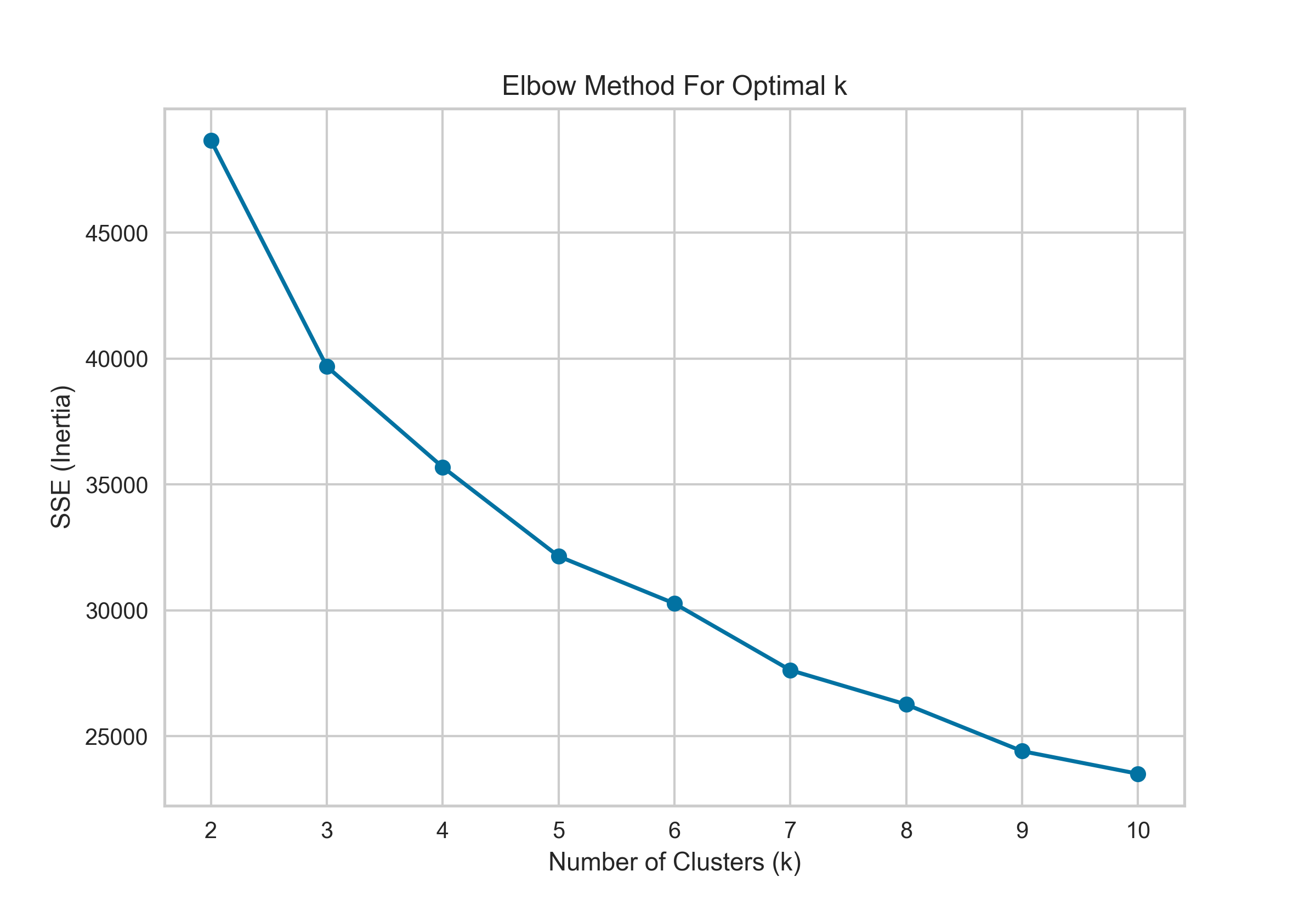
The Elbow Method was applied using the Sum of Squared Errors (SSE) as the evaluation metric. The resulting plot shows a steep decline in SSE from 2 to 4 clusters, after which the curve begins to level off. This indicates diminishing returns in reducing within-cluster variance as more clusters are added beyond this point. The distinct "elbow" in the plot occurs at k = 3, suggesting that segmenting the customers into four clusters offers a good balance between model complexity and explanatory power. Selecting this number of clusters helps avoid both underfitting (too few clusters) and overfitting (too many clusters), making it a statistically justified choice for downstream customer segmentation analysis.
To determine the optimal number of clusters for K-Means, I employed the Silhouette Score technique, which evaluates how well each data point fits within its assigned cluster compared to neighboring clusters. This metric ranges from -1 to 1, where a higher score indicates that samples are well-matched to their own cluster and poorly matched to neighboring clusters—signifying better-defined, more compact clusters.
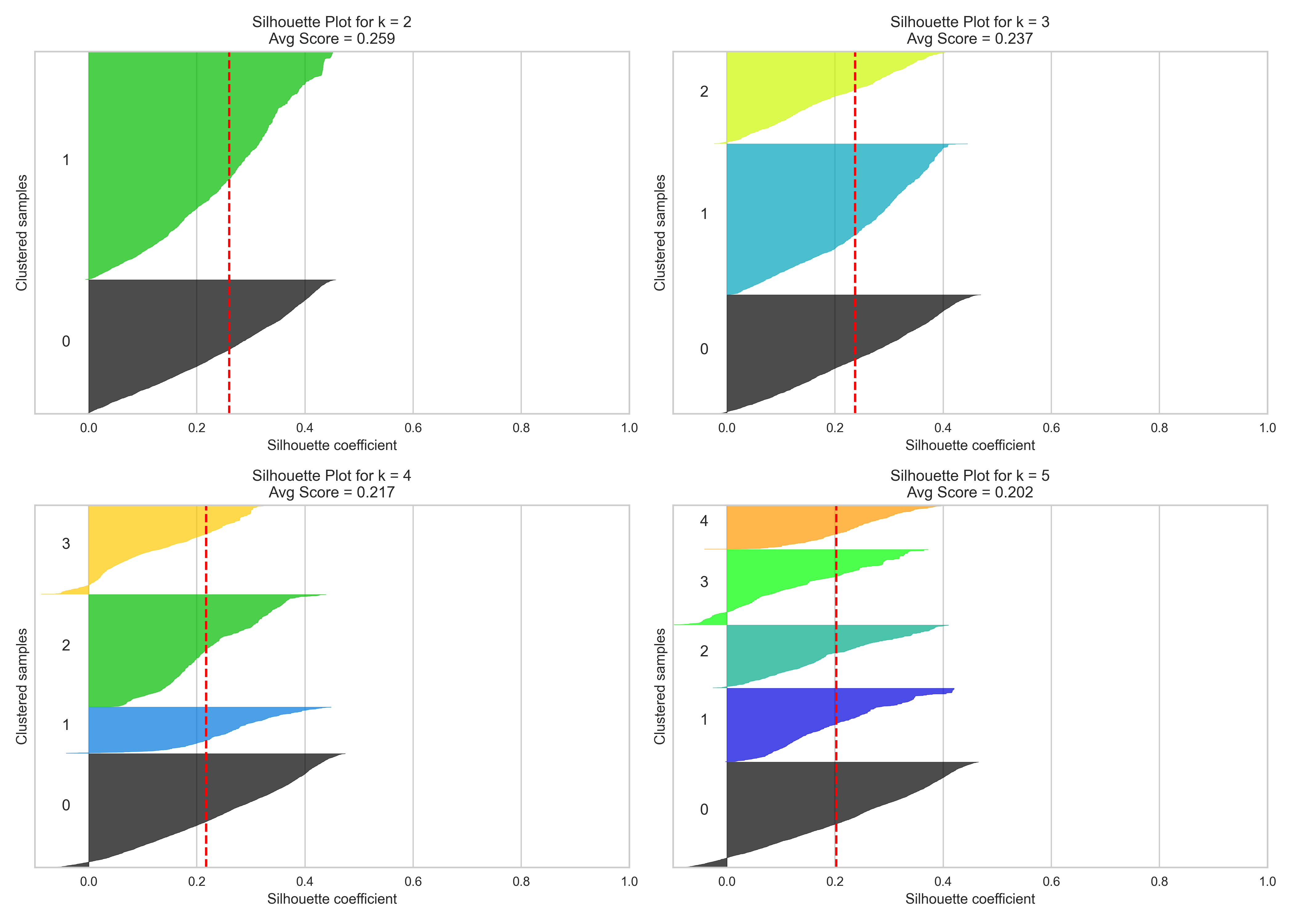
In the figure above, I visualized the silhouette coefficients for k = 2 through k = 5. Among these, k = 3 was selected as the optimal number of clusters. While k = 2 achieved the highest average silhouette score of 0.260, it produced only two broad clusters that risk over-generalizing distinct customer behaviors. On the other hand, k = 3 achieved a respectable silhouette score of 0.237, while also providing more nuanced segmentation that preserves clarity between groups without introducing excessive noise or fragmentation.
Both k = 4 (score: 0.222) and k = 5 (score: 0.218) performed worse and showed more clusters with lower cohesion and overlapping boundaries, as seen in the flatter or more irregular silhouette shapes. These results support the decision to use three clusters, which offer a balanced trade-off between cluster distinctiveness and business interpretability, enabling more targeted marketing actions without overcomplicating the segmentation scheme.
This insight is further reinforced through the PCA scatter plots where the clusters formed by K-Means are projected onto two principal components for easy visual inspection. PCA (Principal Component Analysis) reduces the original multidimensional feature space into two orthogonal axes that capture the greatest variance in the data, allowing us to visually assess the separation and compactness of clusters.

From the scatter plot:
For k = 2, the clusters appear well-separated, but the segmentation seems overly broad. Two groups may not capture the full diversity in customer behavior, leading to generic strategies with limited personalization
For k = 3, the clusters exhibit a clearer structure with distinguishable boundaries, supporting the balance between granularity and interpretability. While there is some overlap between clusters, the separation is still meaningful, and the clusters form relatively tight, distinct groups, suggesting k = 3 offers an optimal partitioning of the customer base without overfitting.
For k = 4 and k = 5, although more clusters are introduced, the additional segments appear less well-defined and increasingly overlapping, especially among clusters located near the center of the PCA plot. This indicates diminishing returns when increasing the number of clusters that added complexity and does not translate into clearly separable groups. Instead, it may introduce redundancy or artificially fragmented clusters.
In combination with the silhouette score findings from Section 2.2, this PCA visualization solidifies the decision to proceed with k = 3, as it provides a practical balance between visual interpretability, cluster cohesion, and meaningful segmentation. These three clusters can now be examined to uncover actionable customer personas and guide targeted business strategies.
| cluster | recency score |
frequency score |
monetary score |
product diversity |
average rating |
basket size |
tenure days |
|---|---|---|---|---|---|---|---|
| 0 | 2.63 | 2.27 | 1.65 | 1.25 | 3.40 | 1348.04 | 33.71 |
| 1 | 3.68 | 4.42 | 4.04 | 2.23 | 3.02 | 3508.88 | 148.05 |
| 2 | 2.73 | 2.37 | 3.88 | 1.14 | 2.73 | 5629.61 | 19.55 |
Based on the clustering results using KMeans with k = 3, the three customer segments exhibit distinct behavioral patterns across key metrics such as recency, frequency, monetary value, basket size, and tenure. Cluster 1 emerges as the most valuable segment, characterized by high recency (3.68), frequent purchases (4.42), strong monetary scores (4.04), and the highest product diversity (2.23). With an average tenure of 148 days, this cluster represents loyal and engaged customers who purchase often, spend significantly, and remain active over time—making them ideal high-spend champions.
In contrast, Cluster 2 consists of customers who spend the most per transaction (highest basket size at 5,629.61) and have high monetary scores (3.88), but exhibit low frequency (2.37) and short tenure (19.55 days). These customers tend to make large, infrequent purchases, suggesting they are likely new or impulse buyers rather than loyal customers. Finally, Cluster 0 represents a lower-value segment with low monetary scores (1.65), less frequent purchases (2.27), and a short tenure (33.71 days), indicating infrequent and low-spending behavior.
These insights are critical for guiding targeted marketing strategies. For instance, Cluster 1 should be prioritized for retention campaigns, Cluster 2 can be nurtured toward loyalty, and Cluster 0 may require re-engagement or cost-effective targeting approaches
| Clusters | Cluster Name | Description |
|---|---|---|
| 0 | Low spenders | Customers who spend minimally and show limited purchasing frequency. |
| 1 | High-Spend | Loyal and consistent customers who generate the highest revenue. |
| 2 | New, Impulse High-Spenders | Recently acquired customers who make frequent, high-value impulse purchases. |
| Cluster | Recency Bucket | ||
|---|---|---|---|
| Mid | Old | Very Old | |
| 0 | 634 | 2586 | 729 |
| 1 | 1184 | 1790 | 125 |
| 2 | 427 | 1624 | 367 |
To validate the effectiveness of the K-Means clustering, we conducted a segmentation alignment check against the RFM (Recency, Frequency, Monetary) buckets, particularly focusing on recency. The cross-tabulation between clusters and recency bucket revealed a strong and logical distribution of customer behavior. Cluster 0 was dominated by customers categorized as 'Old' and 'Very Old', suggesting that this group contains customers who have not engaged recently, likely reflecting lapsed or at-risk segments. In contrast, Cluster 1 had the highest proportion of 'Mid’' recency customers and the fewest in the 'Very Old' category, indicating recent engagement and potentially loyal or high-value customers. Cluster 2 showed a more balanced distribution but still leaned toward older recency, hinting at less frequent engagement or varied customer behavior. Overall, the clusters demonstrate clear alignment with RFM principles, confirming that the model has successfully captured meaningful behavioral segments. This alignment not only strengthens the credibility of the clustering model but also provides a solid foundation for targeted marketing strategies such as retention, reactivation, or loyalty campaigns.
To better understand the population spread across the customer segments derived from K-Means clustering, we examined the proportional distribution of customers in each cluster. As shown in the “Customer Distribution by Cluster” bar chart, Cluster 0 contains the largest portion of customers, making up approximately 41% of the total. This indicates that a significant share of the customer base exhibits behaviors represented by this cluster—likely low frequency, lower loyalty, and shorter tenure, as previously observed.
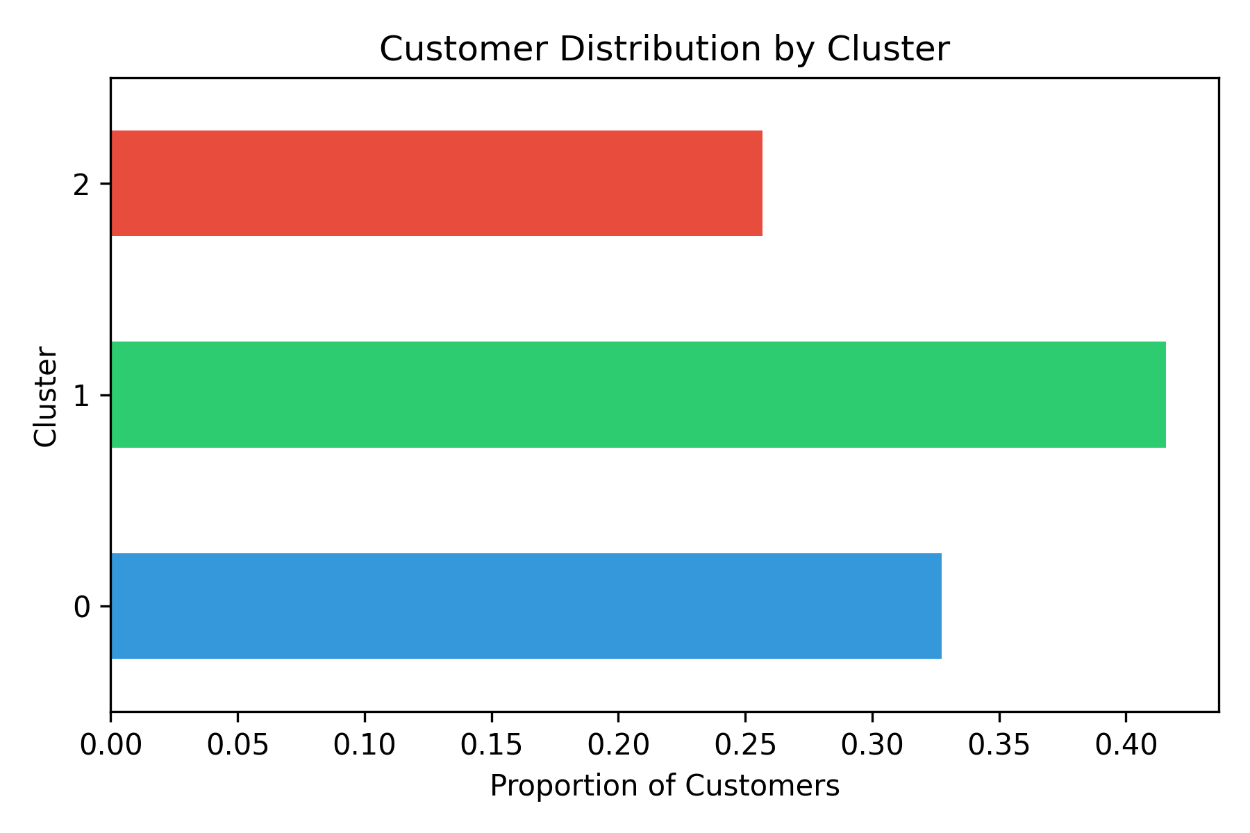
Cluster 1 follows closely with around 32% of customers. Given that this segment reflects the most valuable customers (based on earlier descriptive analysis), its sizable share is a positive signal for business growth and retention efforts. Meanwhile, Cluster 2 accounts for the remaining 27%, representing a smaller but potentially important group such as infrequent high spenders or niche buyers.
This distribution provides operational insights into where to focus marketing strategies: Cluster 0 may need nurturing or reactivation campaigns, Cluster 1 deserves loyalty programs or premium services, and Cluster 2 could benefit from personalized or event-driven engagement.
| Clusters | Monetary ($) |
|---|---|
| 0 | 5663264.77 |
| 1 | 22731435.97 |
| 2 | 14234914.83 |
To assess the financial impact of each customer segment, we aggregated the total monetary value contributed by customers within each cluster. The results reveal a clear stratification in revenue generation: Cluster 1 stands out as the most lucrative segment, contributing approximately $22.7 million in total monetary value. This aligns well with earlier descriptive statistics, where Cluster 1 demonstrated the highest average spend, frequency, and customer loyalty.
Cluster 2 follows with a substantial contribution of $14.2 million, despite having the smallest population size. This indicates that Cluster 2 contains high-value customers who may purchase less frequently but with significantly larger basket sizes—making them strategically important for targeted promotions or high-margin offerings.
In contrast, Cluster 0 contributes the least, with around $5.7 million in total monetary value. This is consistent with the earlier observation that Cluster 0 is the largest by customer count but exhibits the lowest average frequency, monetary spend, and tenure. These customers may be infrequent buyers or churn risks and would benefit from re-engagement strategies or incentive programs.
Overall, this revenue breakdown underscores the importance of prioritizing Clusters 1 and 2 for retention and growth, while Cluster 0 presents an opportunity for improvement through marketing and service interventions.
The final stage of this project focuses on making the transformed and enriched datasets BI-ready that is, structured in a way that directly supports dashboarding, business intelligence queries, and stakeholder decision-making. While the earlier layers (raw, staging, intermediate, and mart) prepared customer-level RFM metrics and clustering features, this stage reshapes the outputs into dimensional and fact tables, following standard data warehousing practices. This ensures that analysts and business teams can explore segmentation insights, customer behaviors, and trends efficiently without revisiting the underlying transformation logic. All the BI – ready piplines had been done using dbt which automatically preprocessing and transform into useful analysis tables.

This table is the foundation for customer-level behavioral analysis. It aggregates recency, frequency, and monetary (RFM) metrics while adding enriched features such as scores, categorical buckets, loyalty flags, and churn indicators. These fields not only normalize engagement and value but also make the dataset immediately actionable for BI dashboards and reporting.
For BI teams, this table is especially valuable because it enables:
| Columns | Description |
|---|---|
| Customer_id | Unique identifier of the customer. |
| Recency days | Days since the last purchase. |
| Frequency | Total number of purchases. |
| Monetary | Total money spent. |
| Recency Score | Normalized 1–5 scores. |
| RFM Total Score | Sum of all three scores. |
| Recency Bucket | Categorical groupings for interpretability. |
| Is churned, Loyalty Member | Business logic flags for churn and loyalty. |
| Product Diversity | Count of distinct product types purchased. |
| Average Rating | Average customer rating across transactions. |
| Basket Size | Average order value (monetary ÷ frequency). |
| Tenure Days | Difference between first and last purchase, capturing customer lifecycle depth. |
This table contains the results of the clustering model. It links each customer to their assigned cluster, while retaining all the behaviour features of the Mart RFM Features table. This allows BI users to not only filter by clusters but also drill into customer-level details. The new columns had been added to this table:
| Columns | Description |
|---|---|
| Cluster | Numeric cluster ID from K-Means. |
| Customer Segmentation | Human-readable cluster label (e.g., High Value Loyalists). |
| Segment Description | Narrative summary of the segment. |
This table provides the customer-level view of clustering results, combining each customer’s assigned cluster with their behavioral metrics, scores, and categorical attributes. It acts as a rich dimension table for BI, enabling analysts to drill down into individual customer profiles while still leveraging the interpretability of segments. Unlike the aggregated cluster summaries, this table preserves granular detail and directly supports customer-level reporting, personalization, and segmentation analysis.
| Columns | Description |
|---|---|
| Identifiers & Segmentation | Customer ID |
| Cluster | |
| Customer Segment | |
| Segment Description | |
| Behavioral Metrics | Recency Days |
| Frequency | |
| Monetary | |
| Basket Size | |
| Tenure Days | |
| Product Diversity | |
| Average Rating | |
| RFM Scores | Recency Score |
| Frequency Score | |
| Monetary Score | |
| RFM Total Score | |
| Bucket & Flags | Recency Bucket |
| Frequency Bucket | |
| Loyalty Member | |
| Is Churned |
This table contains the aggregated view of each customer segment, making it easier for BI users and stakeholders to compare clusters at a glance. While dim_customer_clustered captures the full customer-level detail, fact_cluster_summary distills that information into cluster-level KPIs, helping analysts identify which groups contribute most to revenue and how their behaviors differ.
| Columns | Description |
|---|---|
| Cluster Information | Cluster: Numeric cluster ID from K-Means. |
| Customer Segment: Human-readable label for the cluster | |
| Customer Count: Number of customers assigned to the cluster. | |
| Behavioral Averages | Average Recency Days: Average days since last purchase for the cluster |
| Average Frequency: Average purchase frequency per customer | |
| Average Monetary: Average monetary value across customers | |
| Average Basket Size: Average spend per order | |
| Average Tenure Days: Average length of customer relationship in days | |
| Revenue Contribution | Lifetime Revenue: Total revenue generated by the cluster across its lifetime |
| Recent Revenue in 90 Days: Revenue generated by the cluster in the last 90 days |
This project demonstrated how a structured analytics pipeline—built with dbt, enriched through feature engineering, and extended with machine learning—can transform raw transactional data into actionable customer insights. Starting from the foundational RFM framework, we progressively uncovered deeper behavioral patterns by introducing advanced features such as basket size, tenure, product diversity, and customer satisfaction ratings. These enhancements allowed us to capture nuances that simple rule-based segmentation would otherwise miss.
Through K-Means clustering, we identified distinct customer personas that highlight the diversity of engagement and value within the customer base. High-value loyalists emerged as the backbone of long-term revenue, at-risk low spenders revealed opportunities for re-engagement, and big-basket shoppers highlighted segments worth nurturing toward loyalty. These personas provide a clear strategic lens for marketing teams to personalize outreach, refine loyalty programs, and allocate resources effectively.
Equally important, the BI-ready data mart ensured that these insights are not confined to data science workflows. By reshaping the outputs into dimension and fact tables, we made segmentation results easily consumable for analysts, business leaders, and visualization tools. The combination of granular (customer-level) and aggregated (cluster-level) tables ensures flexibility: stakeholders can both zoom in on individual behaviors and step back to view portfolio-level trends.
Overall, this project illustrates the value of blending modular data engineering (dbt), robust statistical analysis, and interpretable machine learning into a single, scalable framework. The result is not just a one-time analysis but a repeatable pipeline that can power ongoing customer intelligence.
THANK YOU FOR READING!