This project explores the complete journey of turning raw public taxi trip data into meaningful business insights using modern data tools.
It automates the process of collecting, cleaning, storing, and visualizing New York City green taxi trip data across multiple years.
Interactive Dashboard (Secure View)
Live dashboard — sign in with Power BI to interact.
What the Project Does
The system automatically extracts monthly taxi data, standardizes and uploads it to Amazon Redshift through dbt (Data Build Tool),
and refreshes an interactive Power BI dashboard. The dashboard highlights patterns such as total trips, payment method trends,
average fares, and busiest pickup zones — helping users understand how urban mobility and passenger behaviors change over time.
Why It Matters
The dashboard simplifies decision-making for transport analysts and city planners by providing real-time, visual access to key metrics.
It shows how data engineering and business intelligence can work together to make complex datasets accessible and insightful.
Technical Summary
The NYC Taxi Analytics project automates the entire data journey — from data ingestion to visualization —
using a modern cloud-based architecture. The workflow below outlines how raw trip data is collected,
processed, and transformed into actionable insights through an integrated AWS–Redshift–dbt–Power BI pipeline.
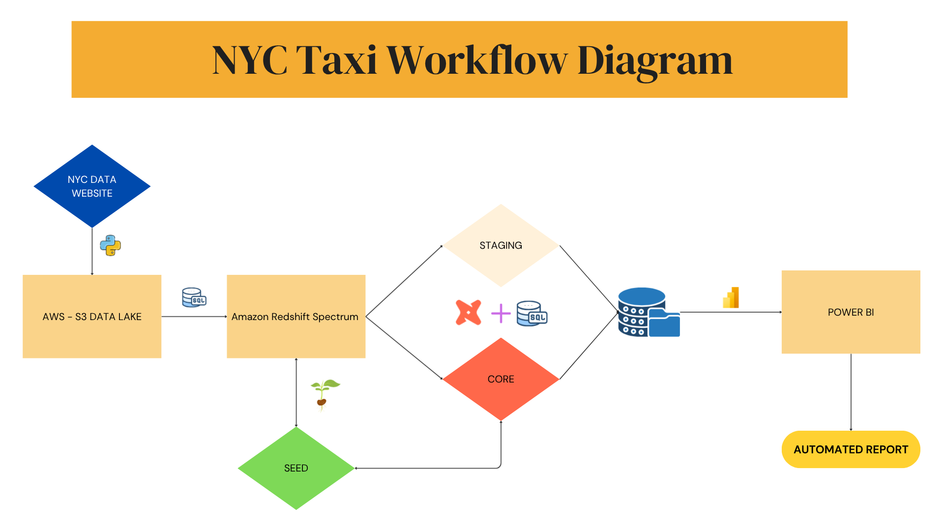
NYC Taxi Data Workflow
This diagram illustrates the end-to-end data pipeline powering the NYC Taxi Power BI dashboard.
Raw trip data is collected from public sources, ingested into AWS S3, transformed via Redshift and dbt,
and visualized in Power BI for automated reporting.
End-to-end NYC Taxi analytics pipeline — from ingestion to visualization.
Data Source: Monthly NYC Green Taxi trip datasets retrieved from the
NYC Open Data portal.
Data Ingestion & Storage: Python scripts extract and clean raw CSV data before
uploading it to an AWS S3 Data Lake, serving as the central storage layer.
Data Processing:Amazon Redshift Spectrum queries S3 data directly.
dbt (Data Build Tool) then structures and transforms it into Staging and
Core models, ensuring consistency and traceability.
Data Modeling:Seed models (such as reference tables) support business logic
like payment types and zone mapping, allowing clean joins and enriched analytics.
Visualization: An interactive Power BI dashboard connects to Redshift
for real-time analysis — including trip demand, payment behavior, revenue distribution, and performance comparison.
Automation: The pipeline is fully automated — each new month’s data is ingested,
transformed, and reflected in Power BI without manual refresh, ensuring up-to-date reporting.
Key Insights
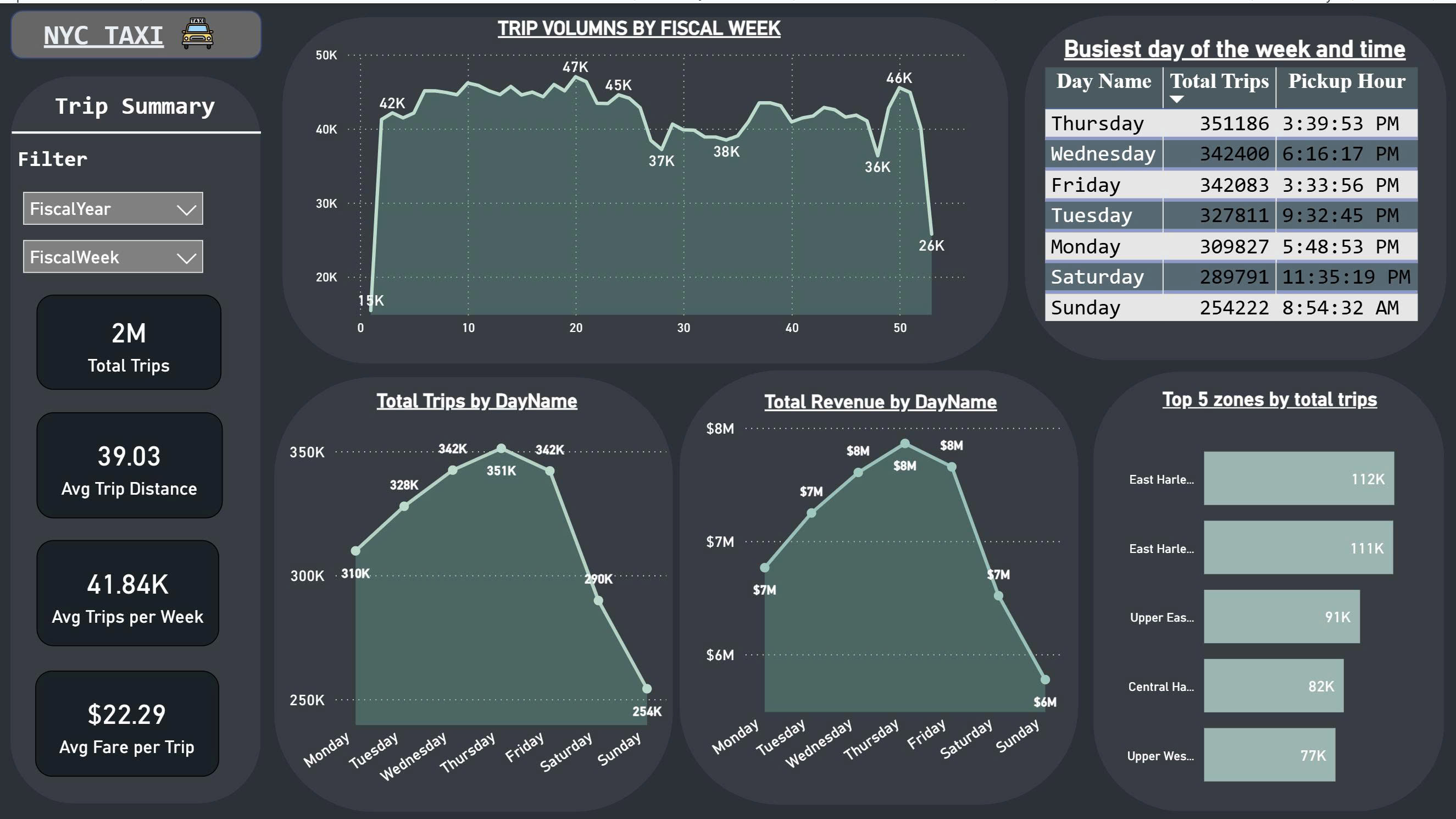
I. Overview Dashboard
Figure 1. Overview Dashboard
This dashboard summarizes New York City taxi activity so non-technical readers can quickly see demand, timing,
and where trips happen most.
Total Demand: Over 2 million trips in the period; typical ride is about 39 km.
Weekly Pattern: Demand is steady year-round with noticeable peaks around weeks 10–20 and 45–47
(likely events/seasonal travel).
By Day:Thursday and Wednesday are the busiest days; weekends are quieter.
Revenue Shape: Follows trip volume — highest mid-week (≈ $8M/day), lower on weekends.
Average fare is about $22.29 per trip.
Top Zones: Highest activity from East Harlem and the Upper East Side,
indicating strong pickup demand.
Actionable Recommendations
Staffing/Supply: Allocate more drivers mid-week (Wed–Thu) to capture peak demand.
Zone Focus: Prioritize supply and promotions in East Harlem and Upper East Side.
Weekend Strategy: Use discounts/tourist offers on weekends to smooth demand.
Revenue Guardrails: Track performance against an average fare target of ~$22 to protect margins.
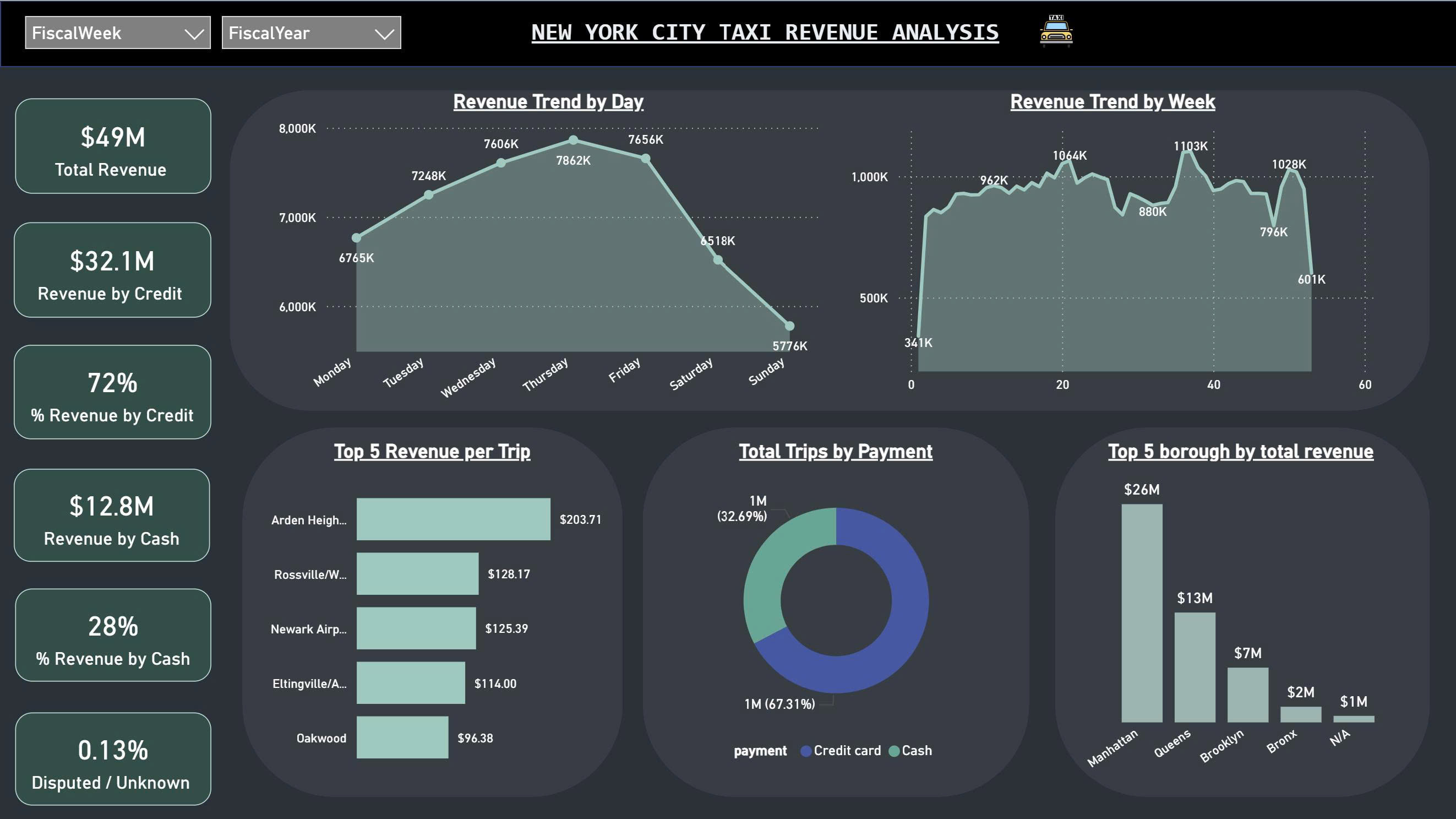
II. Revenue Analysis Dashboard
Figure 2. Revenue Analysis Dashboard
The Revenue Dashboard highlights how New York City taxi revenue changes across time, payment methods, and locations.
It reveals where the money comes from and helps identify which factors drive overall profitability.
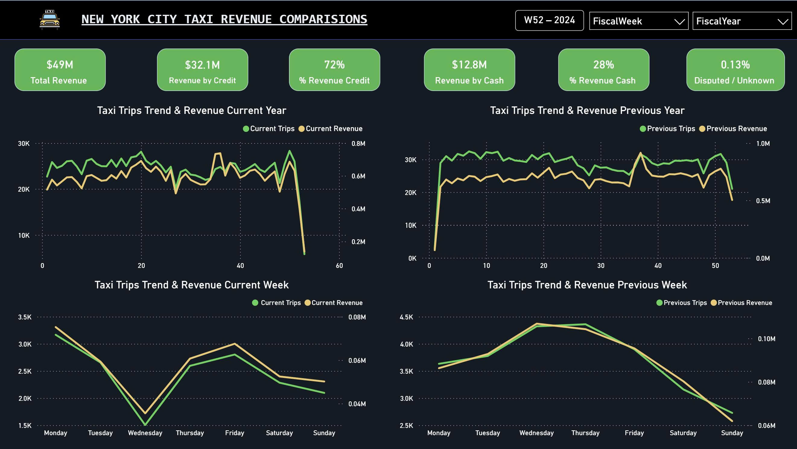
Total Revenue: The fleet generated about $49 million in total revenue during the analysis period.
Payment Insights:
Credit card payments account for roughly 72% of total revenue ($32.1M), showing a clear customer preference for cashless transactions.
Cash payments make up 28% ($12.8M), while disputed or unknown payments are minimal (only 0.13%).
Revenue Trends:
Revenue peaks between Wednesday and Friday, exceeding $7.8M daily before dropping on weekends.
Weekly revenue stays strong throughout the year, with noticeable peaks around fiscal weeks 20–40.
High-Value Areas:
The top revenue per trip is recorded in Arden Heights ($203), followed by Rossville and Newark Airport — areas associated with longer or premium rides.
Revenue by Borough:Manhattan dominates with $26M in total revenue, far surpassing Queens ($13M) and Brooklyn ($7M).
Actionable Recommendations
Encourage digital payments: Since over 70% of customers pay by card, optimize cashless payment processing and partner with card providers for loyalty rewards.
Target premium areas: Focus service quality and promotions in high-value zones such as Arden Heights and Newark Airport.
Balance demand: Create weekend incentives to increase ridership when weekday revenues drop.
Geographical focus: Manhattan remains the primary revenue hub — ensure optimal driver coverage and maintain high service reliability there.
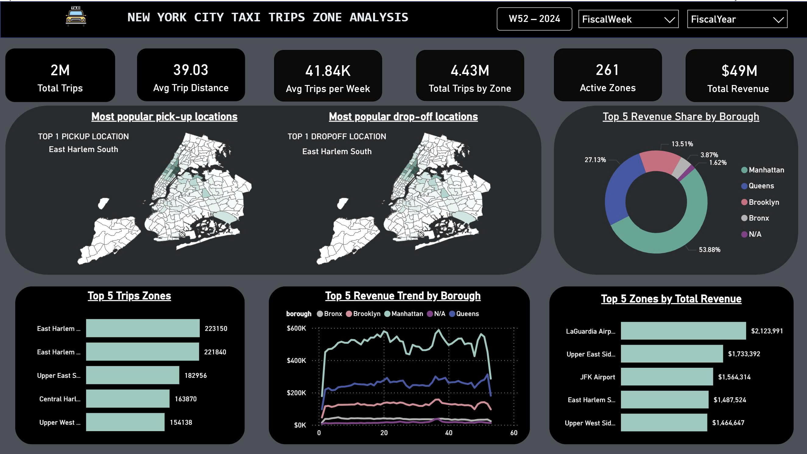
III. Zones Analysis Dashboard
Figure 3. NYC Taxi Zone Analysis Dashboard
The Zone Dashboard provides a geographic view of New York City taxi activity.
It highlights where trips start and end, which areas are most active, and how revenue is distributed across the city’s boroughs.
This helps understand passenger movement patterns and identify high-demand zones.
City Coverage: There are 261 active taxi zones across NYC, generating around 4.43 million total trips.
Top Pick-up and Drop-off:
Both the most popular pick-up and drop-off location is East Harlem South,
showing it as a central hub for passenger flow.
Top 5 Trip Zones:
East Harlem (North & South), Upper East Side, Central Harlem, and Upper West Side record the highest number of rides —
all located in Manhattan’s dense commuter corridor.
Revenue Share by Borough:Manhattan dominates with 54% of total taxi revenue, followed by Queens (27%) and Brooklyn (14%).
The Bronx and other areas contribute minimally.
Top Revenue Zones:LaGuardia Airport leads with $2.1M in total revenue, followed by Upper East Side and JFK Airport,
confirming that airport and central-city rides are the main revenue drivers.
Actionable Recommendations
Strategic Driver Allocation: Focus more drivers in East Harlem, Upper East Side,
and near major airports to capture high trip and revenue zones.
Demand Forecasting: Use these zone patterns to predict daily or seasonal surges and balance supply efficiently.
Partnership Opportunities: Collaborate with businesses or hotels around airport areas for exclusive pick-up/drop-off services.
Urban Mobility Planning: City planners can use this data to manage congestion and improve transport infrastructure in Manhattan’s core zones.
The Revenue and Trips Comparison Dashboard enables side-by-side analysis of how taxi demand and earnings evolve
across different time frames — comparing the current year vs. previous year
and the current week vs. previous week.
This helps identify whether business performance is improving, stable, or declining.
Yearly Comparison:
The upper charts compare trip volume and total revenue over each fiscal week.
They reveal how seasonal peaks and dips shift from year to year, helping detect long-term growth or slowdown in demand.
Weekly Comparison:
The lower charts compare the current week’s daily performance against the same week in the previous year.
This highlights short-term operational efficiency — for example, whether more trips or higher fares occurred this week.
Key Metrics Displayed:
$49M Total Revenue (analysis period)
72% of revenue from credit card payments
28% from cash payments
0.13% Disputed or Unknown transactions
Visual Indicators:
Green and yellow lines represent Trips and Revenue trends respectively,
allowing quick detection of when trip activity and revenue diverge — a useful cue for pricing or service adjustments.
How This Dashboard Works
This page dynamically updates based on the selected Fiscal Year and Fiscal Week filters.
By switching these slicers, analysts can instantly observe year-over-year or week-over-week shifts in both trip counts
and total revenue.
In practical use, managers can quickly check whether operational changes (such as new pricing, driver incentives,
or marketing campaigns) have a measurable impact on performance compared to the same period in the past.
Actionable Insights
Trend Monitoring: Detect early signs of performance dips or surges across weeks and years.
Performance Benchmarking: Track whether total revenue and trip counts are improving
relative to previous time frames.
Operational Decisions: Allocate resources or adjust pricing strategies if weekly or yearly gaps widen.
Data-driven Evaluation: Use these comparisons to assess the success of recent policy or route changes.
Outcome
This project successfully delivers a fully automated NYC Taxi Analytics Dashboard that connects
data ingestion, transformation, and visualization into a single streamlined workflow.
Using AWS S3 for storage, Amazon Redshift Spectrum for querying,
dbt for data modeling, and Power BI for visualization,
the entire pipeline allows real-time insights into trip demand, revenue trends, and geographic patterns.
The interactive dashboards — including Overview, Revenue,
Zone Analysis, and Revenue & Trips Comparison — make it easy for
non-technical users to explore data intuitively.
Through these views, decision-makers can quickly identify when, where, and how revenue is generated,
which areas perform best, and how trends evolve across weeks and years.
From a business perspective, the analysis provides actionable insights such as optimizing
driver allocation during peak mid-week periods, focusing operations around high-demand zones like
Manhattan and East Harlem, and promoting digital payments to align with
customer preferences.
These insights support data-driven planning, cost efficiency, and improved service reliability across the city’s taxi network.
Overall, this project demonstrates how cloud-based data engineering and BI tools can transform raw trip data into
valuable, decision-ready intelligence — bridging the gap between technical analytics and practical business outcomes.